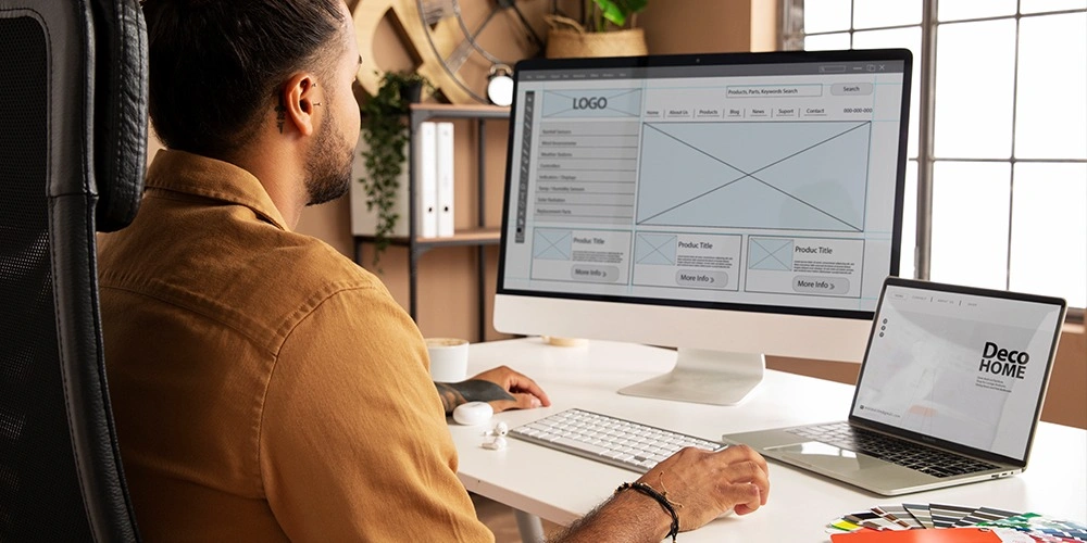
The UX design of the website is extremely important in forming that initial impression for the new user. There are many ingredients that go into the recipe of successful website design, but color theory is one of the most critical elements. A well-chosen color scheme is an important mediator of the appropriate brand message, visitor perception, and a significantly increased conversion rate. A bit of knowledge on how color affects mood and action would provide a corporation the opportunity to explore a better, more effective color to engage the consumer through their digital experience.
Table of Contents
Importance of color in web design
The importance of color in website design extends far beyond just making your site look pretty. Color psychology is the study of how surrounding hues affect our perceptions and emotions, and ultimately, how these perceptions affect user behavior. For instance, studies show that people form unconscious opinions on a product in 90 seconds or less from their first impression, with up to 90% of that decision based on color alone.
Each hue has meanings tied to psychology as well—blue represents tranquility, red evokes passion, and so on. Since red is associated with a sense of urgency, excitement, and action, it works perfectly for those calls to action. Blue is associated with reliability and serenity. That’s why it’s even used by most banks and corporate websites. By leveraging these established associations, designers can build a website design that speaks to their target audience by fostering a more stimulating user experience.
Primary Colors and Their Expected Psychological Reactions
- Red: Associated with intensity, passion, and urgency. When used correctly in web design, it can be very effective at directing people’s attention to where your major sales and promotions are located.
- Blue: Evokes feelings of trust, peace, and reliability. Blue is the color most often associated with sites that want to project professionalism and trust, like banking and healthcare websites.
- Green: Often linked to nature and tranquility, making it popular in website design for environmental and wellness brands. In other cultures, the color is considered lucky and a harbinger of prosperity.
- Yellow: Connect happiness and energy. The use of parallax scrolling should be limited when creating a website to not distract or bombard users with information.
- Purple: Traditionally linked to luxury and creativity, making it suitable for high-end brands and creative industries.
- Orange: Combines the energy of red with the cheerfulness of yellow. Its high-energy, action-oriented quality is great for generating excitement and movement, perfect for call-to-action buttons.
- Black and White: Neutral colors that can add elegance and sophistication. Especially for body copy, where it is important to have high contrast and easy-to-read typography.

Cultural Considerations in Website Design
When creating an accessible website with a global audience, this becomes even more vital. You need to be aware of the cultural connotations of color! As an example, where the color white may represent purity in most Western cultures, it can represent death or mourning in certain Eastern cultures. For example, similarly, red represents good fortune and luck in China, but can represent danger in the United States. Being aware of these cultural differences can better enable designers to choose colors that will be universally accepted or at least adaptable to highly specific user groups.
The Influence of Color Harmony and Contrast
Building a compatible color palette is essential to successful web design. Using a color wheel can assist designers in choosing colors that are either complementary, analogous, or triadic, which are more visually appealing and align with the brand’s message. While decorative touches are welcomed, it’s important to ensure that there’s a strong enough contrast between any text and background colors, which is an accessibility requirement, helping improve readability for all users, especially those with visual impairments.
A/B Testing For the Best Corresponding Color
In website design, A/B testing different color schemes can reveal which combinations work best for your audience. Testing allows you to determine the impact color changes have on top-level metrics such as CTR or CVR. For instance, A/B test results have found that an optimized color button can improve a click-through rate by up to 35%. Regularly testing new designs on user data and feedback helps guide iterative changes of design that meet business goals.
VA Talks Can Improve Your Web Design
To make the most of color psychology’s effects, think about having specialists from a website design company like VA Talks. As one of the top providers of virtual assistance services, VA Talks is experienced in designing beautiful and visually striking websites that harness the principles of color psychology to enhance user experience and increase conversion rates. By understanding your brand’s identity and target audience, VA Talks can craft a customized website design that not only appeals aesthetically but also strategically drives business growth.
Closing Thoughts
Color is an art as much as it is a science, and the psychology of color in web design episodes requires that balance. By learning about the impact of colors on mood and action, organizations can achieve functional web design that captivates and engages users. In this era where everything with a digital presence counts, making strategic use of color psychology is not just a good idea. It’s a necessity for any company that wants to engage deeply with its audience. Color is a powerful component of your design, and with expert partners, you can make sure that your website design is using color to its fullest potential, building a delightful web experience that supports your brand and business goals.


